^ Up : NetApp: Asset Content Management System
Business GoalNetApp needed professional user interface design help for their content management system called ACMS. ACMS is short for Asset Content Management System, a system that would allow various departments througout the company to save and retrieve files like logos and marketing literature.
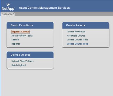
NetApp had started with rough engineering prototypes that were overly system-focused and not designed with users in mind. Furthermore, an AGILE methodology was being used that needed a fast, interative UI development process.
Design SolutionWorking with stakeholders such as NetApp University, who was going to use the application for training purposes, UsableXperience thoroughly explored the user needs, business needs, and engineering needs that were present.
Using AGILE-type documents, such as user stories, helped us determine the functional product goals. We were able to work with team members to articulate any problem areas and gaps in the user stories.
Next, a rapid prototyping process was put in place in order to keep on a tight and demanding schedule. Reviews were held continually to provide team and technical feedback as the prototype progressed. As interaction designs were produced, the wireframe prototypes were checked against the original functional prototypes to assure that all scenarios were covered.
Changes were made quickly, sometimes during meetings with the technical staff as the project moved forward. At the end of the design phase, a visual template was finalized to show what the end UI would look like. Team feedback was incorporated here as well.
Finally, a set of HTML templates with full CSS styles was delivered to the client. We worked closely with Engineering team to make sure that implementation was smooth and any problems that cropped up had a UI solution immediately. . BenefitsNetApp received a cutting-edge solution using dynamic HTML. JavaScripting, and the latest CSS techniques. Their process was speeded up by UX's familiarity with AGILE development methodologies and how a UI designer meshes with it.
The client was able to roll out their testing phase on time and on budget thanks to UsableXperience. .
Examples
Engineering Prototypes
+ Show full size - hold down shift key if new window doesn't appear.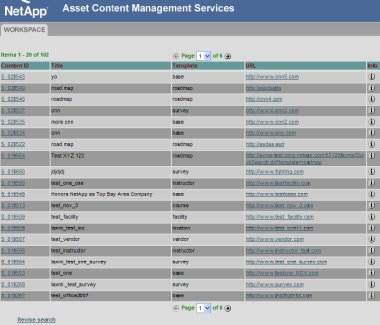
+ Show full size - hold down shift key if new window doesn't appear. As can be seen, the engineering prototypes lacked any clear visual design nor strong communcation of functionality and purpose. We began by using these screens as a guide to the functionality, while trying to think out of the box with regard to user-centered semantics. Wireframing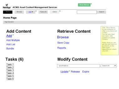
+ Show full size - hold down shift key if new window doesn't appear.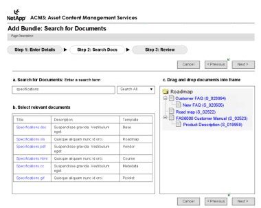
+ Show full size - hold down shift key if new window doesn't appear. A true application UI architecture was put in place to make things like navigation easier and more obvious. Modality was used in forms and wizards in order to isolate the pages from distracting elements. Finalized UI with Visual Template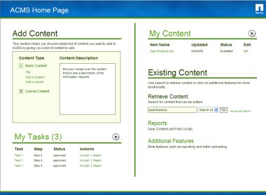
+ Show full size - hold down shift key if new window doesn't appear.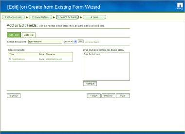
+ Show full size - hold down shift key if new window doesn't appear. Because the final HTML/CSS templates were exact and stringently coded, the templates were able to serve as UI specifications for the Engineering team. The final UI was implemented exactly as specified and received praise from both stakeholders and users at NetApp.

+ Show full size - hold down shift key if new window doesn't appear.

+ Show full size - hold down shift key if new window doesn't appear. As can be seen, the engineering prototypes lacked any clear visual design nor strong communcation of functionality and purpose. We began by using these screens as a guide to the functionality, while trying to think out of the box with regard to user-centered semantics. Wireframing

+ Show full size - hold down shift key if new window doesn't appear.

+ Show full size - hold down shift key if new window doesn't appear. A true application UI architecture was put in place to make things like navigation easier and more obvious. Modality was used in forms and wizards in order to isolate the pages from distracting elements. Finalized UI with Visual Template

+ Show full size - hold down shift key if new window doesn't appear.

+ Show full size - hold down shift key if new window doesn't appear. Because the final HTML/CSS templates were exact and stringently coded, the templates were able to serve as UI specifications for the Engineering team. The final UI was implemented exactly as specified and received praise from both stakeholders and users at NetApp.

